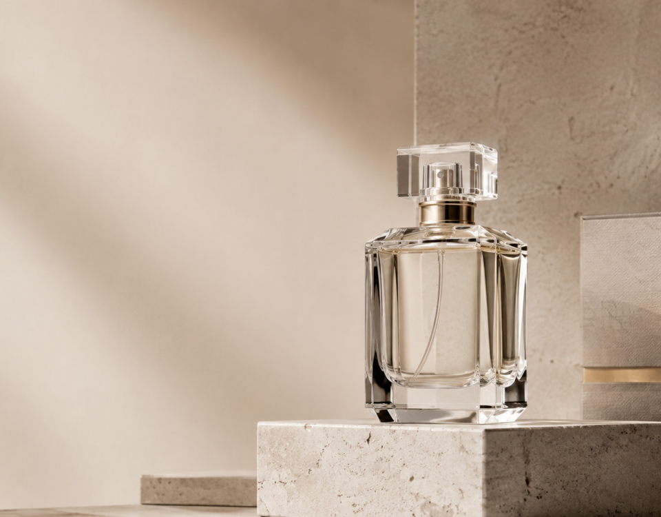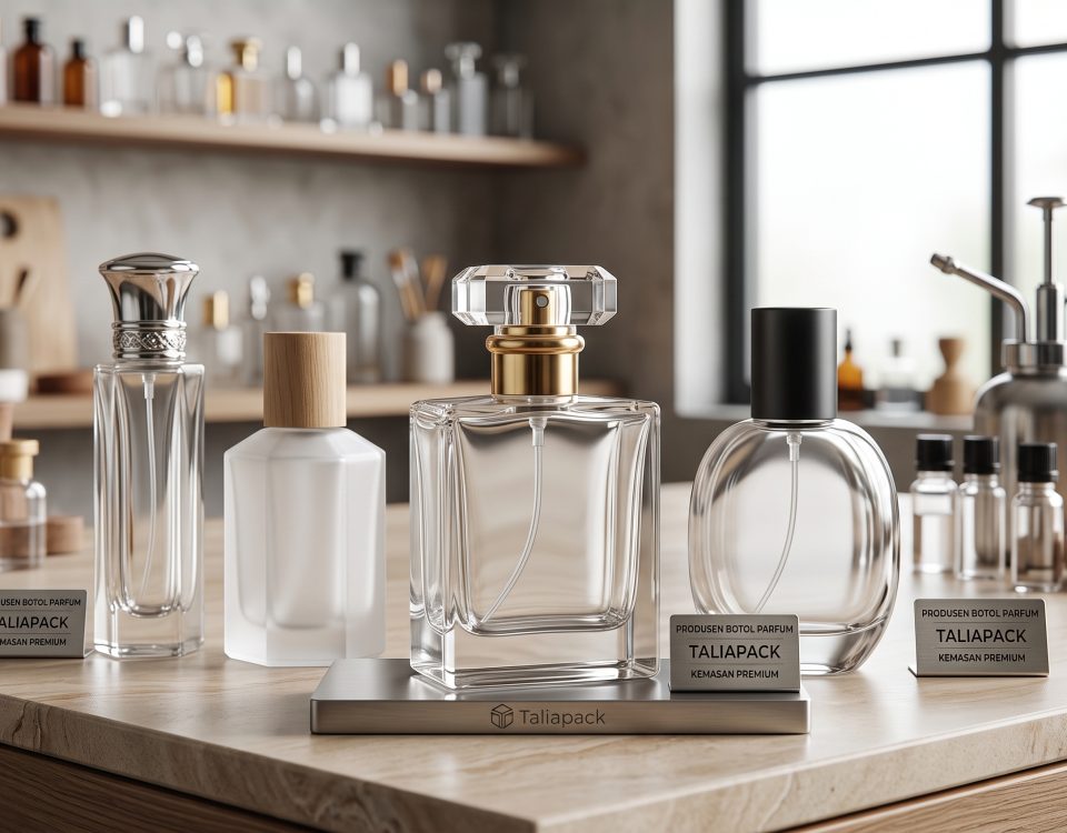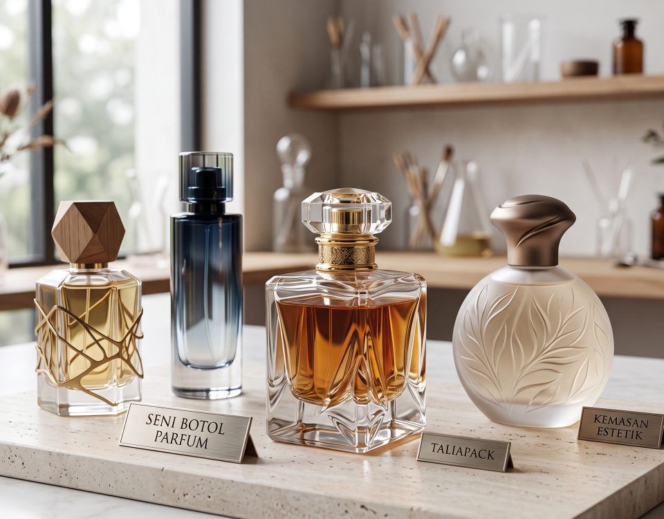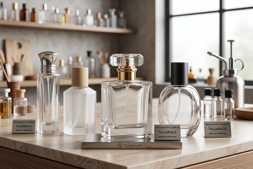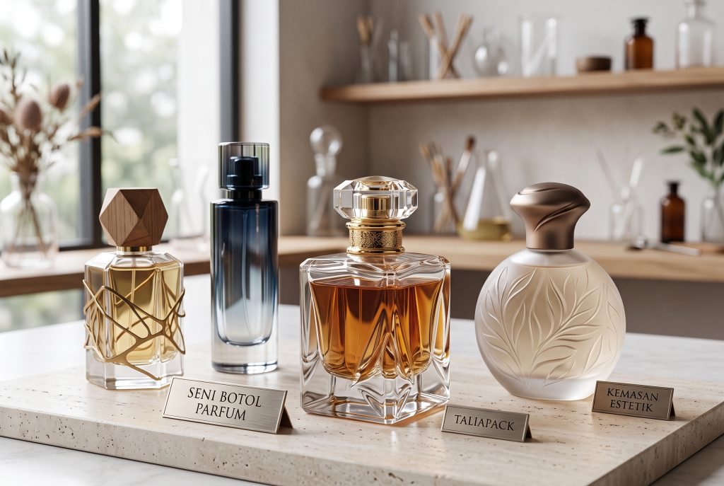

Tidak semua keputusan pembelian dimulai dari aroma. Dalam industri parfum premium, kesan pertama sering kali terbentuk melalui tampilan visual, terutama dari warna botol parfum yang dipilih.
Sebelum konsumen membuka tutup botol atau mencium aromanya, mereka telah membangun ekspektasi mengenai kualitas, karakter, bahkan harga sebuah produk hanya dari kemasannya. Inilah alasan mengapa pemilihan warna menjadi bagian penting dari strategi branding.
Mengapa Warna Botol Parfum Lebih Penting daripada yang Dibayangkan
Warna merupakan bahasa visual yang bekerja secara instan. Dalam hitungan detik, konsumen mampu membentuk persepsi mengenai sebuah produk tanpa membaca deskripsi atau mengenal mereknya terlebih dahulu.
Pada industri parfum, desain botol parfum tidak hanya berfungsi sebagai wadah. Ia menjadi representasi karakter, nilai, dan positioning sebuah brand.
Botol berwarna gelap sering diasosiasikan dengan eksklusivitas, sementara botol transparan menghadirkan kesan bersih dan modern. Pemilihan warna yang tepat membantu produk tampil konsisten sekaligus lebih mudah dikenali di rak penjualan maupun platform digital.
Psikologi Warna dalam Industri Parfum
Setiap warna membawa karakter yang berbeda dan mampu memperkuat cerita sebuah brand.
Hitam
Melambangkan kemewahan, misteri, dan eksklusivitas. Warna ini sering digunakan pada botol parfum premium yang menargetkan segmen luxury.
Putih
Memberikan kesan minimalis, bersih, modern, dan timeless. Cocok untuk parfum dengan konsep clean beauty maupun niche fragrance.
Transparan
Memperlihatkan keaslian isi produk sekaligus menghadirkan kesan jujur dan elegan. Desain seperti ini banyak digunakan oleh brand yang mengedepankan estetika sederhana.
Amber
Selain melindungi cairan parfum dari paparan cahaya, warna amber memberikan nuansa klasik, craftsmanship, dan heritage.
Pink
Menghadirkan karakter feminin, lembut, dan romantis tanpa kehilangan sentuhan premium ketika dipadukan dengan finishing berkualitas.
Biru
Mencerminkan ketenangan, kesegaran, serta profesionalisme. Banyak digunakan untuk parfum dengan karakter aquatic maupun clean scent.
Hijau
Mewakili alam, sustainability, dan botanical luxury. Sangat sesuai untuk brand yang mengangkat konsep natural.
Emas
Aksen emas identik dengan kemewahan, detail, dan eksklusivitas. Penggunaan yang proporsional mampu meningkatkan nilai visual tanpa terlihat berlebihan.
Hubungan Warna Botol dengan Identitas Brand
Brand premium tidak dibangun hanya melalui logo. Identitas visual juga lahir dari konsistensi warna, material, bentuk, hingga detail finishing pada packaging parfum.
Botol hitam matte dapat memperkuat citra luxury yang tegas, sementara kaca bening dengan desain sederhana memberikan kesan refined dan modern. Sebaliknya, kombinasi warna lembut mampu menghadirkan karakter yang lebih personal dan approachable.
Ketika seluruh elemen visual saling mendukung, konsumen akan lebih mudah mengingat brand sekaligus membedakannya dari kompetitor.
Tips Memilih Warna Botol Parfum untuk Bisnis
Memilih warna tidak sebaiknya mengikuti tren semata. Pertimbangkan karakter brand dan target pasar yang ingin dijangkau.
Beberapa hal yang dapat menjadi acuan antara lain:
- Sesuaikan warna dengan cerita dan positioning brand.
- Pastikan warna mendukung konsep logo serta desain label.
- Pertimbangkan jenis aroma yang ingin direpresentasikan.
- Pilih material botol yang mampu mempertahankan kualitas parfum.
- Lakukan pengujian visual melalui mockup sebelum produksi massal.
- Gunakan botol parfum custom apabila ingin menciptakan identitas yang lebih eksklusif.
Investasi pada kemasan yang dirancang dengan presisi sering kali memberikan dampak lebih besar dibandingkan perubahan desain promosi yang bersifat sementara.
Dalam industri parfum, warna bukan sekadar elemen dekoratif. Ia menjadi bagian dari strategi komunikasi visual yang mampu membentuk persepsi, memperkuat identitas, dan meningkatkan daya tarik sebuah produk sejak pandangan pertama.
Ketika dipadukan dengan material berkualitas, proporsi yang seimbang, dan desain yang refined, warna botol parfum mampu menghadirkan pengalaman visual yang selaras dengan karakter aroma di dalamnya.
Bagi brand yang ingin menghadirkan kemasan dengan karakter premium dan konsisten terhadap identitas bisnisnya, proses pemilihan botol sebaiknya dilakukan secara strategis, bukan sekadar berdasarkan tren. Bersama Taliapack, Anda dapat mengeksplorasi berbagai pilihan botol parfum premium, botol parfum custom, serta solusi packaging parfum yang dirancang untuk memperkuat nilai visual sekaligus membangun kepercayaan terhadap brand.
How Perfume Bottle Colors Influence Product Appearance and Consumer Perception

A memorable fragrance begins long before the first spray. In the premium fragrance industry, the initial emotional connection is often created through visual design—particularly the perfume bottle color.
Within seconds, consumers begin forming expectations about quality, craftsmanship, and exclusivity. Even before experiencing the scent itself, the packaging has already communicated the brand’s character.
Why Perfume Bottle Colors Matter More Than You Think
Color is one of the most immediate forms of visual communication. Without reading a label or recognizing a logo, consumers instinctively associate colors with specific emotions and levels of quality.
For luxury fragrance brands, perfume bottle design extends far beyond functionality. It becomes a physical expression of identity, positioning, and storytelling.
A dark bottle may evoke sophistication and mystery, while crystal-clear glass suggests purity and contemporary elegance. The right color allows a fragrance to remain visually recognizable across retail shelves and digital platforms alike.
The Psychology of Color in Luxury Fragrance
Every color contributes to a different emotional narrative. Successful luxury brands choose colors not only for aesthetics but also for the identity they wish to communicate.
Black
A timeless symbol of exclusivity, confidence, and sophistication. Frequently chosen for premium perfume bottles positioned within the luxury market.
White
Represents purity, minimalism, and understated elegance. Perfect for clean beauty concepts and contemporary niche fragrances.
Clear Glass
Transparency conveys authenticity, honesty, and refined simplicity. It allows the fragrance itself to become part of the visual experience.
Amber
Beyond protecting fragrance formulas from UV exposure, amber glass evokes heritage, artisanal craftsmanship, and enduring quality.
Pink
Soft yet luxurious when paired with premium materials. Often associated with femininity, romance, and graceful refinement.
Blue
Communicates freshness, tranquility, and trust. Frequently selected for aquatic, fresh, or modern fragrance collections.
Green
Reflects botanical inspiration, sustainability, and natural luxury. An excellent choice for brands inspired by nature.
Gold
Gold accents introduce prestige and meticulous craftsmanship. When used with restraint, they enhance perceived value without overwhelming the overall design.
The Relationship Between Bottle Color and Brand Identity
Luxury branding is built through consistency rather than decoration alone. Every visual element—from color and materials to finishing techniques—contributes to a recognizable identity.
Matte black bottles often communicate bold sophistication, while crystal-clear glass creates an impression of contemporary refinement. Soft neutral tones tend to express calmness, elegance, and accessibility without compromising a premium image.
When every packaging element works in harmony, consumers are more likely to remember the brand and associate it with lasting quality.
How to Choose the Right Perfume Bottle Color for Your Brand
Choosing a bottle color should never be driven solely by trends. Instead, it should support your brand story and long-term positioning.
Consider these practical guidelines:
- Define the emotional message your fragrance should communicate.
- Ensure the bottle color complements your logo and label design.
- Match the packaging to the fragrance family and target audience.
- Prioritize premium materials that preserve fragrance quality.
- Evaluate prototypes through realistic mockups before production.
- Consider custom perfume bottles to establish a distinctive visual identity.
Thoughtful packaging decisions often create stronger long-term brand equity than short-lived marketing campaigns.
Color is far more than a decorative choice. Within luxury fragrance packaging, it becomes a strategic branding tool capable of shaping perception, expressing personality, and enhancing perceived value before the fragrance is even experienced.
Combined with refined materials, exceptional craftsmanship, and thoughtful design, the right bottle color transforms packaging into an extension of the brand itself.
For brands seeking to develop a more distinctive visual identity, selecting premium packaging should be approached as a long-term branding investment rather than a production decision. Taliapack offers a curated selection of premium perfume bottles, custom perfume bottles, and luxury fragrance packaging solutions designed to help brands express their identity with confidence, precision, and timeless elegance.